Tuesday, 15 April 2014

Saturday, 12 April 2014
Friday, 11 April 2014
Thursday, 10 April 2014
Tuesday, 8 April 2014
Research and Planning Mark
Level 3 (Proficient): 12/20 Marks
Add: Drafts and Production Schedule.
Also add production logs and comments/discussion of each task.
Add: Drafts and Production Schedule.
Also add production logs and comments/discussion of each task.
Friday, 28 February 2014
Production Schedule
Task: Dates carried out:
Researching Genres - 15/10/2013
My Chosen Genre - 16/10/2013
Moodboard - 22/10/2013
Audience Research - 25/10/2013
Reader Profile - 2/11/2013
Costume/Props Planning - 3/11/2013
Title Block Analysis - 6/3/2013
Textual Analysis - 12/11/2013
Photograph Drafts - 18/11/2013-19/11/2013
Photographs Taken - 24/11/2013-28/11/2013
Magazine Drafts - 1/12/2013-8/12/2013
Magazine Cover - 12/12/2013-28/12/2013
Magazine Contents - 2/1/2014-16/1/2014
Double Page Spread Article - 18/1/2014
Magazine Double Page Spread - 20/1/2014-8/2/2014
Researching Genres - 15/10/2013
My Chosen Genre - 16/10/2013
Moodboard - 22/10/2013
Audience Research - 25/10/2013
Reader Profile - 2/11/2013
Costume/Props Planning - 3/11/2013
Title Block Analysis - 6/3/2013
Textual Analysis - 12/11/2013
Photograph Drafts - 18/11/2013-19/11/2013
Photographs Taken - 24/11/2013-28/11/2013
Magazine Drafts - 1/12/2013-8/12/2013
Magazine Cover - 12/12/2013-28/12/2013
Magazine Contents - 2/1/2014-16/1/2014
Double Page Spread Article - 18/1/2014
Magazine Double Page Spread - 20/1/2014-8/2/2014
Wednesday, 26 February 2014

Tuesday, 25 February 2014

Monday, 24 February 2014

Thursday, 20 February 2014
Original Magazine Photos
Front Cover

Double Page Spread
The front cover and double page spread use the same costume and props however integrate different shots. Using different shots helps prevent boredom when reading through the magazine, however costumes had to be the same as my front cover made it clear that the main article would use this artist so it had to be relatable.
Contents Page

This image uses the same model previously seen in other pages. However introduces the second side to the rap lifestyle previously discovered in earlier planning. The shot still uses discrete, more common conventions of rap such as the ring jewellery.

The second picture used in my contents page also presents conventions of rap found in earlier planning. Hats and rings were often seen throughout costume and props analysis of existing artists meaning my shots become more realistic by including the features. Body warmers were also frequent in costumes found in planning.

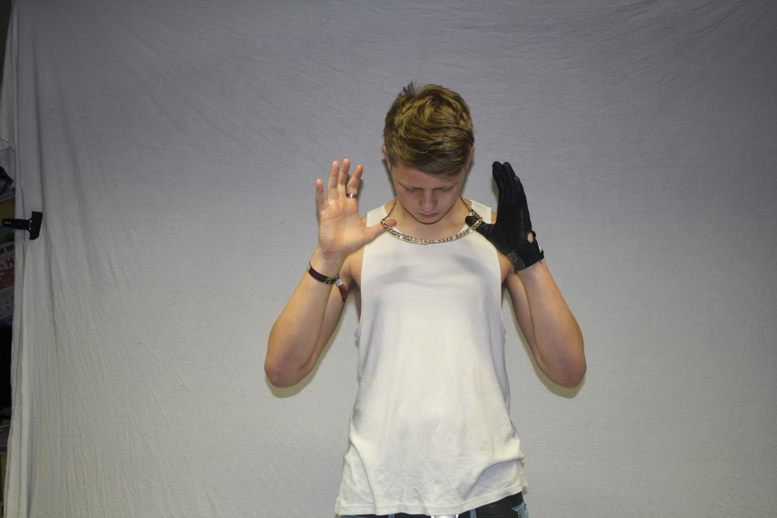
My final picture uses hats and hoody which were both frequently seen throughout planning. Both items are often associated with the rap genre. The model used is using a hand gesture which are also a typical convention of rap, they connote gangs which are relevant within this genre.
Wednesday, 19 February 2014
Double page spread article
Luke Moore, better known as his stage name Young Toolz, grew up with his mum in North London. At 15, he was expelled from school and decided to stop education all together, this was when he started making short free style rap videos and posting them onto YouTube. Progressivly the young ameture started recieving more and more views and began to recieve recognition for his short videos. At 16, Luke created his image of Young Toolz and the name has stuck with him ever since. He started writing and posting full songs and joining minor social events where he would do warm up performances before headline acts. From the shows Young Toolz was able to expand his recognition and begin to build a fan base. For the next year Young Toolz stuck to making YouTube tracks and began to make music videos aswell. In 2011 Young Toolz released his first mixtape ‘Dedicated’ including six songs. From the mixtape Young Toolz watched his fan base grow and at 18 years old, he entered an underground rap competition were he won from a crowd vote. This was the begining of the Young Toolz era. Luke’s YouTube blew up over night as he recieved up to 120,000 views on videos. 3 weeks after his victory at the competition Young Toolz was approaced by an ameture record company who offered him a deal to produce an album under their name in return for advertisement. Shortly after agreeing Young Toolz relesed his dedubt album ‘Only the Begining’ which was supported from his fan base and recived effective advertisment from the record label. After the successful release, the business offered Toolz a record deal including a wage although Luke declined deciding to produce his next album ‘To The Top’ on his own over the next 18 months. In early 2014 Young Toolz released the album only to find himself reaching number one on the charts with his single hit ‘Power’ following the sales of the album Young Toolz has recently announced the tour dates and locations begining in June and is currently selling tickets. Young Toolz has told Grind that he plans to release one more solo album before thinking about the next stage in his career.
Wednesday, 15 January 2014
Title Block Analysis

The magazine 'We Love Pop' clearly represents the pop genre and shows connotations in its logo. For example the bright colours represent the younger audience particularly pink connoting females. The title comes across as clean and almost animated to represent its content being clear and non-explicit.

Kerrang is a heavy metal magazine and follows the conventions associated with the heavy metal genre in its title. The rough font connotes the represented genre of heavy metal being aggressive and loud.

The title represents a pop/rock magazine and the font and presentation is simplistic to show how the magazine only involves these genres.

This title is also uses a simplistic approach with its title, a larger font is used to show the name and 'magazine' is shown below as its not as important

The font style chosen for my magazine integrates re-occurring features found from other magazines mastheads. Most magazines used large black fonts to help them stand out on the magazine. Vibe used simple spaces between each letter which I thought was effective to the reader as it makes the masthead very clear. I tried to find a font which slightly introduced the spaces as I believe readers will be more attracted to a title that looks good. To further improve the aesthetics, I introduced a discrete drop shadow onto the title to help in stand above other text used on the front cover.
Monday, 25 November 2013
Costume/props planning
Costume


Many costumes involved hoods and gloves to cover up a lot. However on the other side of rap other lifestyle is explored of the stereotypical gangster where costumes involve suits and ties which could also be considered in the costumes used in my product.
Props


Re-occurring props include glasses and jewellery. This helps me plan for my shots used as I want to try and make it as realistic as possible, meaning jewellery should be considered.
Friday, 15 November 2013
Reader Profile
Reader
Profile: The Urban Reader
Josh is 21
and is finishing his final year at university in Brighton, studying a course in
engineering. He has a weekend job at a local garage where he fixes small car
and bike problems. Josh has loved listening to music and hip hop has been his
favourite media since he was 14. Important parts of his life are encouraged by
hip hop such as his fashion style, hobbies and some of his social life. Josh
always carries his iPod with him to listen to his music throughout the majority
of the day; he especially likes listening to music through studying engineering
or working on a job. Josh also owns an apple mac and occasionally makes his
version of beats he’s heard from his favourite songs. He is always seeking
latest news around hip hop involving artists and their lives outside of music.

Tuesday, 5 November 2013
Graph Results for Magazine Questionnaire


The results show me what my target audience is likely to be interested in when reading the double page spread. From this I can see that customers will prefer news about an up-coming artist rather than an already famous musician or band.


The front cover is the first thing the audience see so I needed to make sure I included what the customers would want to see. The results suggested that I should focus more on the title and images used, this helped me organise my planning in future tasks.
Monday, 28 October 2013
Mood Board

My mood board explores segments of the rap and hip hop culture. Not only does it focus on a range of different artists, but also integrates their lifestyles outside of music. This is important to the research phase of my main assignment because I plan to include a biography of an up-coming rapper in a main article, meaning some knowledge of a rappers life outside of the music industry could be effective in later stages of the project. The pictures of different musicians also helps me plan for my pages as it gives me a brief understanding of the presentation that needs to be thought about. An early insight such as props and costumes can be looked at through the range of pictures used here, re-occurring themes such as jewellery and chains can be remembers to make more realistic photos in later production.
Sunday, 27 October 2013

Subscribe to:
Posts (Atom)